Posted on
September 24, 2012 by
RevStu
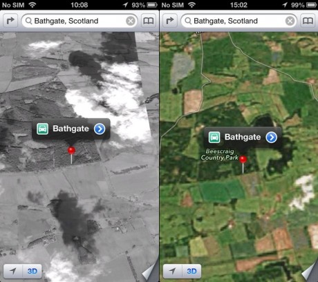
Like picking at a scab or peeling sunburned skin (and roughly as attractive) there's something addictive about the sheer awfulness of Apple Maps. Having already highlighted its total inability to perform the most basic function of an electronic map – finding places to within, say, five miles of their actual location – I couldn't resist going back to the Apple Store later the same day to document the visual quality of its maps. And because a picture's worth a thousand words, let's get straight to the results.
Read the rest of this entry →
Category
analysis, useless Apple cunts
Posted on
September 24, 2012 by
RevStu
The internet is, let's say, a place known for exaggeration. So while the examples of Apple Maps that have been posted everywhere in the last few days were pretty compelling evidence, we weren't going to be absolutely sure until we'd seen it with our own eyes. So once the queues of worthless human refuse had died down, we popped into the Apple Store this morning and had a look.

Readers, take everything you've heard about how bad Apple Maps is and double it.
Read the rest of this entry →
Category
analysis, useless Apple cunts


